Trouble in Paradise…
Even for a perfectionist/OCD type like me, the extent of the tinkering involved in moving a score toward the desired ideal of music-visual beauty can be daunting. (Funny to think that there really is a visual aspect to music, innit?) Fasten your seatbelts — here are some examples from my adventures in music notation troubleshooting!
Finale gives you two different ways of viewing your music on the computer screen: Page View, where you see it exactly as it will print out (after you’ve moved heaven and earth to make it pretty) and Scroll View, where the music stretches in an endless horizontal stream past the virtual boundary of your computer window. Scroll View is the most hassle-free mode to use while you’re entering notes; later on when you change to Page View, you get to pay the piper by dealing with all the picky formatting issues that inevitably come up.
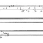
Here’s the opening of my Theremin Concerto in Scroll View:
Looks pretty good, but it doesn’t allow for the page breaks that you need if you want to have an actual score to hand to a conductor. So let’s switch to Page View and see what the first couple pages look like.
Mr. Readmore has lots to show you! (non-high-speed users beware: photo heavy post ahead!)

Yikes, what a mess! Three problems are immediately obvious:
- Distribution of measures across the pages: too many on page 1, too few on page 2!
- Empty staves taking up space — if an instrument’s not playing, we don’t need to see its empty staff!
- What’s with that big blank space at the bottom of each page?
Happily, these problems aren’t too hard to fix. With a few key clicks, you can redistribute the measures; you can tell Finale how many measures to include in each system, and you can also shunt individual measures from one system to another by highlighting them and pressing the up or down arrow key.
Before:

After:

Next, I’ll tell Finale to remove the empty staves from each system, except for the first one — I want all the instruments playing in the piece to appear at the very beginning. Now I have two systems on the first page, and no wasted space.

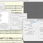
Oh, and in case you’re wondering why my score has all those pretty colors on it — Finale has several different tools that you use to create different elements in the score. It’s helpful when you’re editing if you can keep track of which tool you used to create a given item; assigning a different color to each tool helps with that.

Finale’s tool palette
Of course, when the score is printed out for the musicians, it’ll be black ‘n’ white. Because, you know, classical music is serious business. 😛
Once you have the measure-and-system layout squared away, you can get down to nitty-gritty, microscopic-level details; here’s where your inner perfectionist will burst into paroxysms of joy.

As I mentioned previously, Finale has gotten smarter and smarter over the years about laying out the different elements the way you’d actually want them to appear. But for some reason, it still does things like the above once in awhile. Those poor notes need some elbow room! That slur is leaning on that sharp sign — ouch!
Various methods of dragging, nudging and adjusting take care of that.

Even after I had gone over everything with a fine-toothed comb, I still found a couple of suboptimal things, even after creating pdf files and sending them off. :'(

!@##$%^&*%$#!@
Why am I swearing like a sailor, you ask? Well, that punta d’arco marking above the Violin II staff shouldn’t be bumping up against the pp marking below Violin I. One’s chocolate is in the other’s peanut butter, if you will.
Here’s where your inner perfectionist has to be willing to “let go and let God”… you can fuss and tinker forever, but at some point you just have to stop… and accept the fact that there will probably be some imperfections, no matter what you do. Hey, that’s what editors are for, right? Dang, gotta get me one of those… 😉
Coming up next: The Last Step, where we find that the parts is more than the sum of the score… or something like that… 😀

If you enjoyed this post, would you consider…
Thanks — you make the world a better place! 🙂
Wait a minute, MMN, where’s the choral part? Singers, honey, you need singers!!
Seriously, thanks for glimpse into the world of music composition. I now appreciate my scores more.
Hello, I am a copyist in Chicago and I’m embarrassed to say I have no idea how your “punta d’arco” expression hides the barline like in your example. Looks great! how did you do that?!
J, Charles, I’m really glad you asked, because I had forgotten about that, and it took me some digging around in various dialog boxes to retrace my steps!
Do you know how you can put an enclosure around a text expression? Rectangle, circle, etc? I chose rectangle, then clicked edit. I resized the enclosure as tightly around the text as I could. Then I clicked the box next to “opaque” and set the line thickness to zero. Voilà!
It would be nice if there were an option to make an expression opaque right there in the Text Expression Designer, so you wouldn’t have to bother with the “phantom” enclosure. And maybe there is now — I haven’t upgraded to the latest version.
Hope that helps! 🙂